
Amateur Typography
As a part of my education about graphics, it seemed about time to intentionally select and use fonts with an eye to producing readable output.
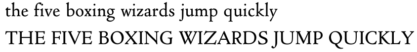
To start this endeavour, I found a replica of one of the first typefaces which our modern eyes can readily access. Designed around 1470 by Nicolas Jenson, this face adapts the miniscule letters used in calligraphic writing to the majuscule lettering used in inscriptions (and as seen in Gutenberg's publications) to produce what we know of as upper and lower case (modern terms taken from the location of the two drawers in the typesetter's case). This, and similar faces, known as Venetian style, form the foundation of modern western font design.
The particular face I chose was as close as I could find to Jenson's original, it's called Cloister Old Style. Although bold face lettering wouldn't appear for nearly 400 years after this face was designed, this particular family does have four styles (roman, italic, bold and bold italic).
Getting this font into X applications was trivial, but after dumping them into ~/.fonts, I discovered that the four styles were given different family names. We can thank Windows for that, I think -- with only four different styles available for each family, font foundaries have mixed the style into the family name to ensure the user would be able to select each desired font. I ended up editing the fonts with Fontforge to fix their family and style names.
Getting this font into LaTeX was rather more involved. After about four hours, I had found sufficient LaTeX, dvips and psnfss documentation and deduced enough about the debian changes to those to try and get custom fonts into a LaTeX document. What a horror. I did write a shell script to help with this process -- once one has named the font files appropriately (yes, the names must follow the nfss conventions), one can run this script over the resulting .ttf files to add them to one's LaTeX/dvips environment. I create Type42 files as intermediaries as this (should) bring the TrueType hints along to the output file, making it potentially more legible on a screen. The result, however, is that 'pdflatex' can't handle the font files, so one has to run dvips and then dump that through ghostscript to generate pdf (using dvipdf).
To set some text, I chose a sample paper that Carl and I wrote for OLS two years ago about cairo (then Xr). I started by using the document class file written by Bart Massey for last year's Usenix annual conference. That cleaned up a lot of the header problems -- they were too small before and had way too much mandatory white space around them. After that, I started thinking about what to do for a monospaced font. Courier was what the document used originally, but that's a poor color match for Cloister Old Style. Looking through my own limited selection of fonts, I identified Bitstream Vera Sans as the closest in color, but the lack of serifs made each instance stand out like a sore thumb.
So, it was back to the net to find something that looked nicer when set with Cloister Old Style. The number of decent monospaced fonts ever made can probably counted on one's fingers, so the choices were limited. I settled on Bitstream's Prestige 12 Pitch. It offers a color similar to Cloister Old style with slab serifs, and even a few beveled serifs on the ascenders. Of course, the x height was too large, but that is adjustable in TeX by hacking the t1bpr.fd file put in the /usr/local/share/texmf/tex/latex/psnfss directory by my shell script. I found a cute hack which lets this scale factor be configured in the document (or other style file):
\expandafter\ifx\csname Pr@scale\endcsname\relax
 \let\Pr@@scale\@empty
\else
 \edef\Pr@@scale{s*[\csname Pr@scale\endcsname]}%
\fi
With this, one inserts \Pr@@scale after the <-> in each
DeclareFontShape invocation and then a \def\Pr@scale{0.8} into the style
file and now all instances of this family are scaled by 0.8 which matches
the x height of Cloister Old Style.
With compatible fonts in hand, I turned to line spacing. Traditionally, a font with a small x height needs extra vertical spacing between lines to keep things readable. Looking back at the first book published with Jenson's typeface, Eusebius, De Evangelica Præparatione, I note that the leading is actually quite small, similar to what we use today with the typical largish x height faces. When trying that spacing, I found it rather dense, so I ended up setting the leading to 3.5 points for the 12 point size used in the body of the document, for an interline spacing of 15.5 points.
The resulting output seems an improvement over the document as published at OLS.